The Good, the “Meh” and the Ugly
A designer’s look at US State flags
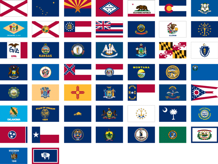
Let’s face it, most US state flags are ugly. More than half of US state flags feature a blank field (majority blue) with some sort of detailed state seal in the center. In fact, 38 of the 50, over 75%, break RULE NUMBER ONE* in flag design:
DO NOT PUT WORDS ON A FLAG
List of US State flags alphabetically by state. Credit http://www.cfflag.com/stateflags.html
You see, I am from Texas; the birthplace of taking state pride too far. If you travel to the ‘Lone Star State’ (yes, even our state nickname derives from our flag) you will probably see more Texas flags than you will American ones. I grew up thinking that this was normal. However as I started to travel and became interested in other state’s flags, I found it much more difficult to spot them while driving down the highway.
I found that other states fly considerably fewer state flags than Texas. But why? Of course, as a designer, I started noticing design trends.
States with poorly designed flags flew them far less than states with well designed flags.
If you are from one of these states, you may be saying
“So what? Who cares if we have an ugly flag? I’m still proud to be from _______”
What is the point of a state flag anyway?
Having a well designed flag gives residents a visual symbol to rally behind. It is a cheap unifying icon that represents large diverse groups of people. Great state flag designs are seen not just on the capitol building but on homes, walls, cars and license plates. Sports teams might even incorporate it into their branding.
A selection of major sport teams that incorporate their state flags into their branding
This seems to be the proper hierarchy of pride.
Nation -> State ->City/Team
But in states where they have no decent visual branding in the form of a flag, state sports teams (with their superior logos, traditions and colors) usually take over the visual branding of a state. Citizens then funnel what state pride they have into their respective team. This creates more “team pride” than “state pride” and can segment state pride when you have more than one dominant team. (cough Alabama cough)
Flag design isn’t where state pride is born, but it’s where it can live and grow.
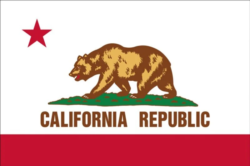
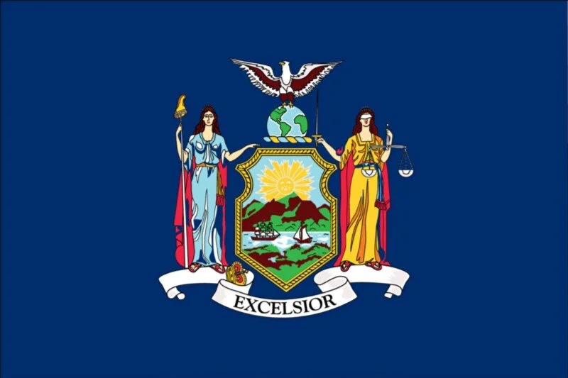
California, Texas and New York happen to be the three most populous states respectively. I’m choosing them because their flags also represent the spectrum of state flag design; Texas being well designed, California’s being in the middle, and New York being terrible.
The Good
Texas — Texans will identify as a Texan before they will as an American. Unbiasedly I would rank it as the state with the most state pride. I believe consequently Texas probably flies more of its state flag than anyone else. I called Flags Unlimited and asked them what was their highest selling state flag. I think Laura used the word “oodles” and “by far” when she told me Texas. She also said Ohioans are also proud of their flag mostly because of its unique shape.
If you were to ask a Texan why they have so much pride, they will probably give you answers about being their own country before being a state…as if Texas were the only one. (Hawaii, who still sports a British Union Jack on its flag, was also a country if you were wondering)(Vermont and California as well)
It’s also a commonly accepted myth that since Texas is the only state that was a country (still wrong), it is the only state that can fly their flag at the same height as the American flag. As much as Texans want it to be, it’s not true either.
According to the United States Flag Code, any state flag can be flown at the same height as the U.S. flag, but the U.S. flag should be on its right (the viewer’s left).
What can’t be argued is that the Texas flag IS the state identity. All smaller identities, teams, cities, etc. fall under it in the hierarchy. It’s successful because its design is simple, it has a history, and is broad enough to represent all groups who fly it. Other well designed flags would be New Mexico, Arizona, Alaska, Colorado, Maryland, Ohio, Tennessee, and South Carolina.
The “Meh”
California—The third largest in land area, it has a storied independent history (represented on their flag) and it’s the most populated state. That sounds like a great recipe for a very proud populous. However state pride in California is a bit divided.
In fact, California has such a large amount of people spread out over such a large landmass that NorCal people have very little in common with SoCal people. In 2013, a proposal was put forth to separate California into six separate states.
Even as far back as the 1940's, the “State of Jefferson” in NorCal tried to secede from California. It failed because of poor timing. The date they chose to break away was over-shadowed by an event we call Pearl Harbor.
California’s flag honestly not that bad. I quite like it personally. I like the use of the red bar at the bottom that sets a nice baseline and grounds the design. Even the asymmetry of the star makes it feel well thought out. However the bear is a bit detailed and limits the “can a child draw this from memory” factor. Duplication of the flag usually ends up with a different bear and soon you have no conformity. Not to mention RULE NUMBER ONE*, though of all the offenders, this is my favorite.
However, the flag of California, while still being popular, isn’t the main logo of the California brand. You will certainly see them when visiting California, but not in as strong numbers as states like Texas and Ohio.
Other middle ground state flags would be Hawaii, Alabama, Arkansas, Indiana, and I’ll even throw Oregon in there for being the only two sided flag of the bunch.
The Ugly
My wife recently lived near Buffalo, New York for a time. This morning I asked her if she knew what the flag looked like. She had no idea and never remembered seeing one during her stay.
New York is another interesting case because, like California, the state is divided. ‘Downstate’ New Yorkers are fiercely loyal to New York City rather than the state itself. ‘Upstate’ New Yorkers will usually introduce themselves by saying “I am from New York STATE” or “UPSTATE New York”; putting a lot of effort in to telling you where they are not from instead of taking pride in where they are from.
Yet when it comes to flags, Upstaters usually aren’t seen wielding a New York state flag and a New York City resident probably couldn’t tell you what the NYC flag looks like.
Contrast that against similar large historic cities like Chicago and DC who are insanely proud of their city flags. So why do New Yorkers not fly flags at all?
Maybe because design-wise, both New York and NYC flags kinda suck.
If you want to test if your state’s flag is in this category, do what I call, “the tattoo test”. Is your flag simple enough and good looking enough to where someone could/would tattoo it on themselves if they had enough state pride to do so?
If your state flag fails that test or hasn’t been mentioned above, then unfortunately it belongs in this category. But there is hope.
Why bad flags stay bad
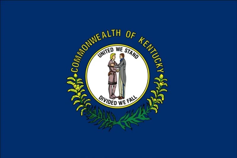
What I’ve found though is that people in “blue flag” states frequently have no idea what their flag is.
I recently gifted my best man at my wedding, a flag of his home state of Kentucky. He looked at it as if he had never seen it before. Luckily, it breaks RULE NUMBER ONE* and says “Commonwealth of Kentucky” on it. He may not have recognized his flag, but he sure could recognize a University of Kentucky Wildcats logo.
I also gifted a flag to my cousin from Louisiana. Up until that point, he had never known the Louisiana flag features a mother pelican “tearing its breast” to feed its blood into the hungry beaks of its children. No joke.
States with ugly flags don’t fly them very much. Residents then have little to no knowledge of what their flag looks like. No one, therefore, cares enough to change it. Flag stays ugly. Repeat.
Time for change
State pride is a great thing to have and step one is getting a flag to rally behind.
It’s time we have a massive overhaul of our state’s flags. Honestly, I can’t think of one reason that we wouldn’t redesign many of the US state flags. Getting it done will take people that care, and designers that are able.
Notice I did not say “public flag design contest”. It usually never ends well.


